
A familiar identity
A vector redraw keeps the recognisable tape measure and red lettering crisp. The established slogan remains central.
Breese Window Supplies / Redesign preview · Not yet launched
Keep the name people know. Show the real work. Make it easier to find the right service and speak to the people doing the job.
Kevin and Jerry’s business already has its own identity: a tape-measure logo, “Measurably Better” and years of customer feedback. The website needs to feel like their business.
The redesign brings their project photographs, service choices and direct contact details forward, with a calm green palette and less competing information on each screen.
02 / Before & after
Actual browser captures at the same 1280 × 800 viewport, taken on 18 September 2026. The redesign is a working preview, not the live replacement.
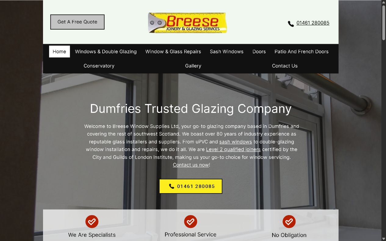
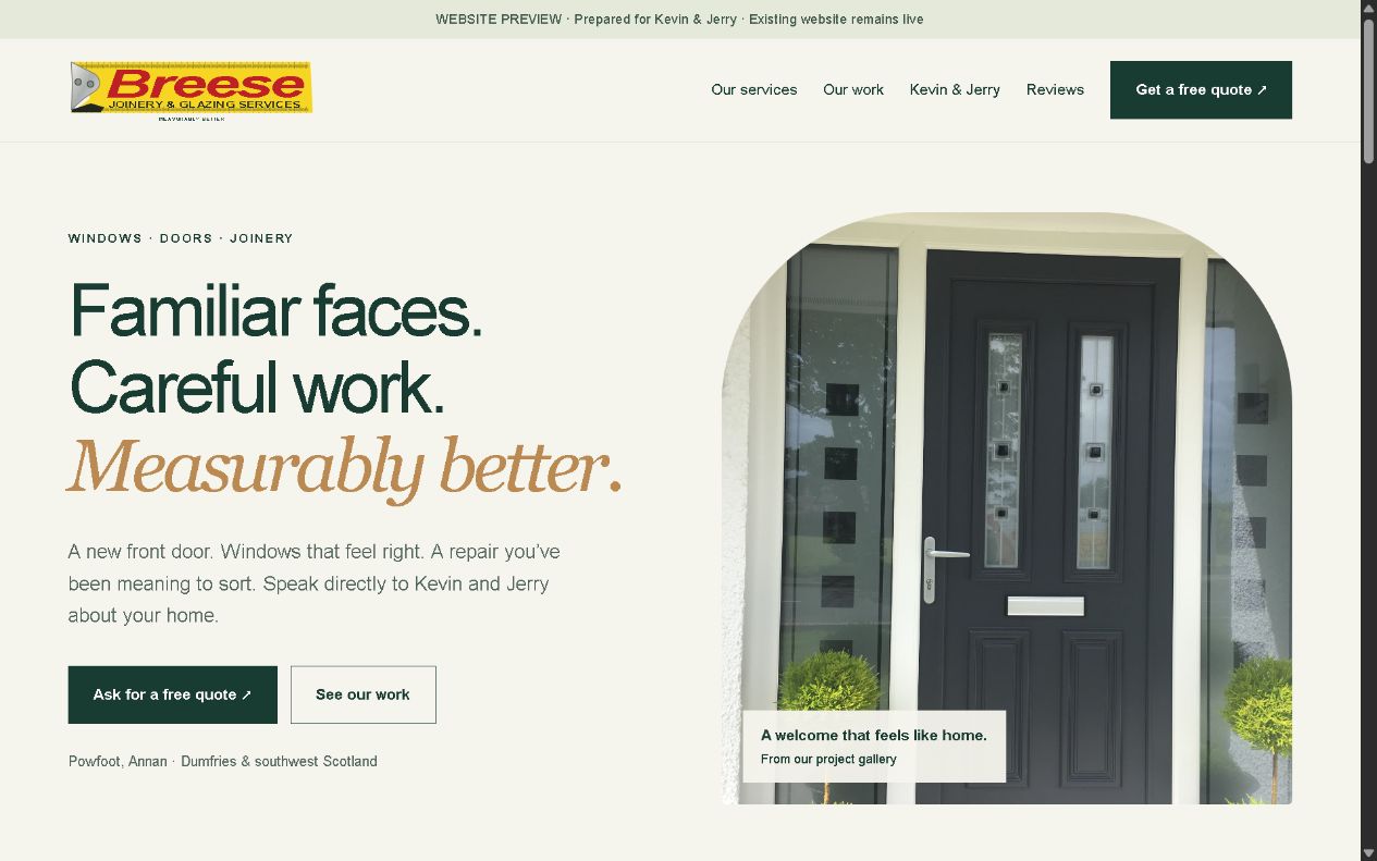
03 / What changed
A vector redraw keeps the recognisable tape measure and red lettering crisp. The established slogan remains central.
Seven existing project photographs replace illustration placeholders. Visitors can filter and enlarge the gallery.
Dedicated pages preserve windows, sash windows, repairs, doors, patio/French doors and conservatories.
Phone links, a mobile call bar and an email enquiry path keep the next step straightforward.
04 / Where the project stands
The ten-page preview has been built with existing business photographs and attributed historic reviews. The enquiry form prepares an email in the visitor’s own email application; it does not send or store the enquiry automatically.
Owner review, business details, the logo redraw, privacy information and the domain handover remain before launch. The existing public website remains live while the redesign is reviewed. The next phase is owner feedback, final content and a planned domain transition.
Talk about your website ↗Connect the dots
Start with the people, the work and what your customers need next.